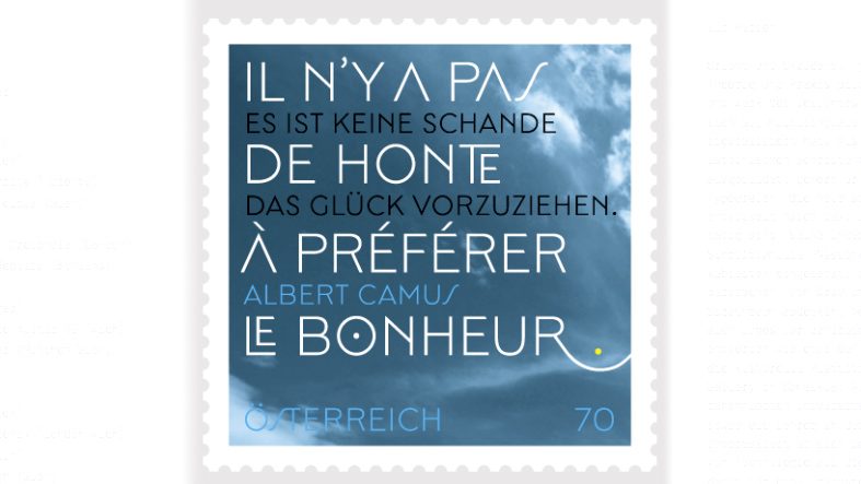
The art of simply living well and finding happiness therein is the expression of an approach which is often overshadowed today by the search for banal material gain. The notion of seeing quality of life as an end in itself, quite unconnected with any quantifiable output, is one which has been valued by different cultures across the ages. In Europe, it is bound up with cultural, scientific and social achievements which to a certain extent define human access to quality of life as a public responsibility. These achievements have shaped Europe and it seems important to defend them. With a font developed specially for the stamp, my design is formally related to the history of European lettering. Floating in a somewhat threatening sky, the quotation symbolises the yet to be fully fulfilled potential of the European idea.
Titus Nemeth (*1983)
tntypography.com
The poles of Orient and Occident; typography and geography and theory and practice are central to the life and work of the designer Titus Nemeth, a specialist in the design of multilingual lettering. As an Austrian who was brought up and trained in the Latin script tradition he is one of the few Western typographers to be active in the area of – and to have developed new - Arabic fonts. The winner of a number of international awards, his “Nassim” family of fonts is used, for example, by the BBC websites aimed at the Arabic, Persian, Urdu and Pashtu-speaking communities. In addition to fonts, Nemeth has also designed logos for a number of Arabic clients including the children’s’ channel of Al Jazeera, the Hakaya cultural platform and the Noon Gallery in Damascus. In his roles as a researcher at the well-known University of Reading in Great Britain and teacher at the Ésad in Amiens he is particularly interested in the influence of technology on font design and, hence, in issues which he also practically confronts in his role as a book designer. As a typographic consultant, Titus Nemeth is currently responsible for the bilingual series of books “Classics of Arabian Literature”, which is being published by the New York University Press.