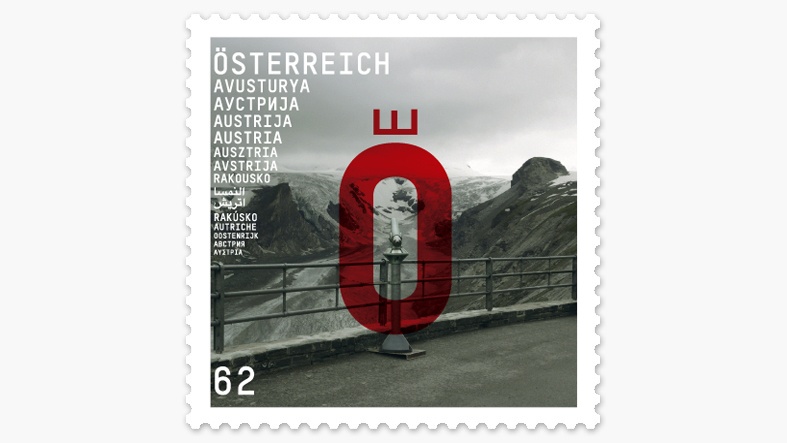
Upon closer examination, however, this reputation is highly dependent upon the historical work of those artists who were almost all children of the Empire in an age in which the country was more than just the geographical heart of Europe. This work is an attempt to visualize a metaphor which doesn’t romanticise the wonderful Sissi image but which has remained with me like a landmark since a drive over the Großglockner-Hochalpenstraße - rather like the names “Kaiserin Elisabeth-Ruhe” and “Kaiser-Franz-Josefs-Höhe”. There, I was very close to Austria’s highest point and gazed at the melting Pasterze glacier. Hence, the red O with the crown now marks the navel while the telescope behind it might help one to gain a deeper insight.
Nik Thoenen (*1963)
The work of the Swiss graphic designer Nik Thoenen, who was born in 1963 and has lived in Vienna since 1996, emerges from the conflict between intuition and reflexion, font development and graphic design. He travels regularly from Vienna to Berne, where he runs the “Binnenland” label which he established together with Michael Mischler in 2007. The partnership has already created eight new fonts and commissions to design monographs for artists such as Michael Aschauer and Claudia Märzendorfer or of artists’ magazines for the “Palais de Tokyo” in Paris provide regular opportunities to put these fonts into practice. Thoenen’s experimental approach ensures that his projects lead to highly individual results – although these results, however different, invariably share the same conceptual precision and, not unusually, radical reduction. A particular interest of Thoenen is the spatiotemporal dimension of signs and the way in which this is just as effective in both the logic of the alphabet and the sequential nature of reading as it is in a book which, as a bound pile of type, also always contains compressed time. This interest finds a public outlet in such commissions as the title font for the architecture magazine “domus” or the signage for the Cultural Centre in the French city of Metz.