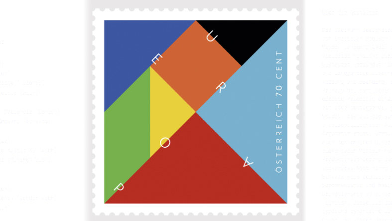
One interpretation of the tangram reveals to us the essence of Europe: once a closed form it was later broken up by war and self-interest into many small fragments. Some large and some small: Some loud and some quiet. Hence, the unit seems fragile and fragmentary from within whereas, from outside, it appears stable and strong – held together by the sense of “Europe”. And the design features the seven colours out of which every one of Europe’s flags can be created.
It is these identities within an identity that, for us, lie behind Europe’s uniqueness.
Seite Zwei, Christian Begusch (*1978) & Stefan Mayer (*1981)
seitezwei.com
The two-man office “Seite Zwei” (which translates as page two) was founded in 2011 by Christian Begusch and Stefan Mayer, two designers who complement each other perfectly in every way. For not only did they study and work together for many years in the areas of advertising and branding but, above all, they share the belief that the notion of design must be given top priority in any project. As a design studio, “Seite Zwei” is driven by ideas and a commitment to experimentation which focuses on meeting a wide variety of challenges with acute analysis and clear arguments. Directness and straightforwardness are also central to a design language which seeks to use the most basic elementary means to maximum effect. By limiting itself to the use of black and white, the product presentation of the Austrian vodka brand Neft makes a clear reference to Russian Suprematism while speeding up the basic geometrical elements into a short kinetic study in the form of a film. This dynamic dimension, which is so typical of the work of the team, is also found in the CD cover for the Viennese jazz violinist Mario Gheorghiu, where the free improvisation of “Seite Zwei” using graphic means gave the characters a much clearer sense of notes and musical rhythm.
The two-man office “Seite Zwei” (which translates as page two) was founded in 2011 by Christian Begusch and Stefan Mayer, two designers who complement each other perfectly in every way. For not only did they study and work together for many years in the areas of advertising and branding but, above all, they share the belief that the notion of design must be given top priority in any project. As a design studio, “Seite Zwei” is driven by ideas and a commitment to experimentation which focuses on meeting a wide variety of challenges with acute analysis and clear arguments. Directness and straightforwardness are also central to a design language which seeks to use the most basic elementary means to maximum effect. By limiting itself to the use of black and white, the product presentation of the Austrian vodka brand Neft makes a clear reference to Russian Suprematism while speeding up the basic geometrical elements into a short kinetic study in the form of a film. This dynamic dimension, which is so typical of the work of the team, is also found in the CD cover for the Viennese jazz violinist Mario Gheorghiu, where the free improvisation of “Seite Zwei” using graphic means gave the characters a much clearer sense of notes and musical rhythm.